This is an updated rendering with the ceiling treatment. A wood panel system will cover the ceiling including the escalators. The panels are continuous throughout the entire floor and follow the outside edges of the the ceiling. In addition, there are slight height variations to cover the lower part of the escalators as well as HVAC systems.
Saturday, April 30, 2011
Wednesday, April 20, 2011
Perspective from the Kids Section
To have a feeling for the space, I created a rendering showing a perspective from the kids section looking towards the check-in area. The curved steps and the ramp in the bottom part of the rendering show the reading area of the kids section. Kids will sit around a reader like in an amphitheater or enjoy sitting on the steps reading a book on their own.
First Floor Plans
These are the first four floor plans. The Program is indicated by the colors and the circulation by the arrows.
Thursday, April 14, 2011
Approach from West
These two sketches show the West facade, which will be crucial for the approach of the building. Most visitors will see this facade first. Since I use the "fiber" for the public components in my library, I decided to extend the organic shaped elements to the West facade to create a canopy over the public entrance. Visitors recognize by the facade which areas are public and which are private inside the library.
Tuesday, April 12, 2011
Circulation in Section
This section shows the circulation of public and private. There will be three public entrances. One is located at the West side of the "private building", which takes visitors directly to the fourth, sixth and seventh floor. The other two entrances (escalator and elevator) are located underneath the private building. Visitors, when entering the library from the public building, have the option to explore the building by using the escalators, but also use the bridges to enter the "private building" to participate for instance workshops in the computer lab or special showings/ presentations in the auditorium. After a presentation, the visitor may use the grand stairs in the auditorium lobby area to reach the top floor with the upper bridges which lead to the roof-top cafe. A separated entrance is dedicated to the librarians in the Eastern part of the "private building".
Program in Section
This section shows a general distribution of the program within the library. The public building will house the stacks, collections, reading and meeting areas and a roof-top cafe. The private building will house the administration, a big computer lab, the auditorium and audio/ video labs. All spaces located in the private building do not necessarily need natural lighting and are somehow connected to computer technology, this resulted the particular distribution of the program.
Monday, April 11, 2011
Sun Path Study
This sun path study shows the site with its context buildings, which are all on average 50 feet tall, as well as the core of the "public building" which will rise to approximately 90 feet. The red volume indicates the core. Since the public building with its open and airy feel will house the stacks of the library, it is important to determine how the sun will penetrate the site. I decided to raise the public building by 20 feet (as shown in my study model), which also means that the south facade of the public building has an unobstructed sun exposure at noon throughout the year. As indicated in my study model, I placed the core along the south facade to create a "sheltered area" for the stacks north of the core.
March/September 21 at 9am,12pm and 3pm
June 21 at 9am,12pm and 3pm
December 21 at 9am,12pm and 3pm
The core is also situated slightly east to accommodate a slope that connects the roof to the upper bridge.
An additional reason for placing the core along the south facade is to ensure unobstructed views of the Brooklyn Bridge in the north.
Thursday, April 7, 2011
Facade Sketch
This is a sketch of how both building facades will look together. The lines on the "private" building will made of corten steel. It has a natural brown tone which will run into the horizontal elements of the "public" building and continue in a similar tone of wood.
Sunday, April 3, 2011
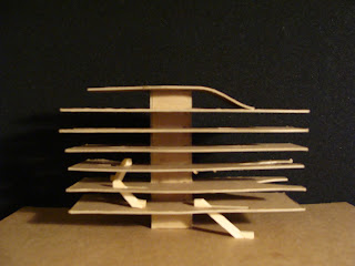
Study model "Fiber" building
The first five pictures show the study model for the "fiber" building, which will house most public components of my program. Each floor has an open feel to it with virtually no distraction other than the core. Angled escalators create an intriguing way of circulation through the building. Openings in the floor slabs, which "grow"/widen or narrow, create a vertical connection through the building.

The following pictures show the first approach of a facade treatment with organic flowing horizontal elements. The vertical elements tie the horizontal elements together and give the facade the irregular feel like single fiber strains in a piece of paper.
Friday, April 1, 2011
Facade development
This is a study of the facade of the "private" building
The shaded areas indicate a setback in the facade. The white areas will cantilever and are primarily means of circulation through the building.
The Area with the layered line indicates the auditorium. Additional setbacks occur on the West side to break up the facade.
The lines terminating in circles indicate the means of circulation.
The circles indicate the continuation of the circulation within the building.
Subscribe to:
Comments (Atom)


